
Fog
I came to San Francisco ill-prepared for perpetual fog. My experience with fog growing up involved seeing it occasionally in the fields peacefully awaiting the morning sunrise. This fog is different. It's malevolent. It's fog that means business.Some places in the city rarely get fog, but during the summer most places are ensconced in it. I live in Hayes Valley, which sits right on the boundary between fog and no fog. It's the first thing I see when I look out my window in the morning and I can see it roll across the city after work, making everything clammy and cold. This weekend, the fog inexplicably cleared away. I don't understand the principles that govern fog here, but I didn't stop to ask questions. Instead, I took the opportunity to bike down to Golden Gate Park and bask in the rare sunshine. Just a clear day with sunshine and trees and the wind at my back.
![]() Posted August 27, 2005
Posted August 27, 2005
On Ontologies
While I was home over the summer, I found a new article over on Clay Shirky's site that resonated with me, and it stuck in the back of my mind. Ontology is Overrated.
![]() Posted August 23, 2005
Posted August 23, 2005
Zeroing In
From the moment I walked in the door at CMU, I started building a mental list of design firms. A snippit of conversation here, a glimpse of website there. Over the course of two years I developed a pretty broad picture of the top players in Design, but it was still mainly on the surface. Halfway through my second year, I started visiting as many firms as I could to get a feel for their cultures up close. New York, San Francisco, Chicago, Seattle, Boston, Pittsburgh... Rochester... I had a total of 15 interviews, some at design firms and some in-house. I had some good interviews and some bad ones, but the experience turned out to be a vital part of my education.In the end, my decision boiled down to four companies. After some serious soul-searching, I made the jump, packed up the U-haul and headed cross-country to start work as an interaction designer at Smart Design in San Francisco. I'm incredibly excited about the move and the new job. More soon!
![]() Posted August 8, 2005
Posted August 8, 2005
This Space Left Unintentionally Blank
I guess it's time to write a bit about on why I haven't posted anything in a while. The last few months of grad school were killer. I spent most of the time focused on the very real challenge of keeping my head above water. When it gets down to crunch time, meta-activities like blogging go right out the window. Once graduation roled around, I was only too happy to get away from technolgoy for a while. Over the next few days, I'll post a bit about what I've been up to during my hiatus.
![]() Posted August 3, 2005
Posted August 3, 2005
Wayfinding Demo
The bulk of my last semester at CMU was devoted to building and testing my wayfinding project. The concept was fleshed out by Christmas, but making it work was another story. Plenty of late nights working in Flash and struggling with the limitations of anemic cellphone processors.I'm trying to develop a network of geo-tagged images that let visitors find their way visually from landmark to landmark within an unfamiliar environment. I developed a demo of the system for the CMU campus and populated it with images taken by students from the university. I developed and tweaked the design right up through May, when I had students from the University of Pittsburgh come over and test out the design on our campus.
The actual demo is designed for a handheld cellphone, but you can get an idea of how it worked from this online version.
![]() Posted May 15, 2005
Posted May 15, 2005
Wayfinding in Design
For me, the thesis essay requirement at CMU was by far the most intimidating part of the grad school process coming in. A lot of it is just the word, "thesis." It conjures up images of 18th century academics mulling over ancient leather books and discussing Copernicus. A big part of overcoming that initial sense of awe was simply reading through past thesis essays. I spent a lot of time browsing through the stacks over at Baker library getting a feel for what a thesis really is, and also tacitly reassuring myself with the knowledge that every design grad before me had faced down this challenge and won.Like my project, my thesis essay centers around the concept of wayfinding. Early on, my professor Dick Buchanan encouraged each of his advisees to break our main topics down into three discrete ideas for study. Here's how I approached it:
In my thesis essay, I focus on three key aspects of wayfinding design: place, exploration and understanding. In traditional wayfinding practice, we understand a place by exploring it, by being there. I'm interested in how this occurs. How does an exploration of place lead to understanding? With this question in mind, I investigate the distinction between place and space, and between exploration and discovery. I also articulate four levels of understanding as they apply to human experience, and suggest ways in which place, exploration and understanding are interconnected. Ultimately, I explore the potential for wayfinding to stand as a metaphor for Design itself.
After two years, and much wailing and gnashing of teeth, here's the completed thesis. Wayfinding in Design [PDF 100K]
![]() Posted May 15, 2005
Posted May 15, 2005
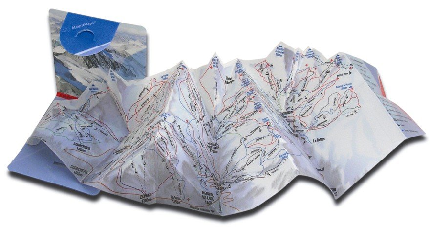
Pop-up Topographic Map
I've been collecting mapping examples since I started my wayfinding research last summer. One of most useful I've come across has been the series of popout maps from Map Group. Today though, Jeong pointed me to a gizmodo article about the mother of all popout maps. It's a popout/popup topographic map of a ski resort in Austria by a company called MountMaps. I really want an animated picture of this.
![]() Posted February 16, 2005
Posted February 16, 2005
LOST BANK CARD
I got a terse e-mail from CMU this morning telling me that my card was found in the ATM over at the University Center. I've never left my ATM card in any other machine, anywhere, but it's happened twice at the Citizen's Bank ATM here at CMU. I decided to figure out why.There are actually two Citizen's Bank ATMs side-by-side in the University Center. One has a swipe card reader. The other holds the card until the end of the transaction. I worked at a bank when I was in college, and our ATM was forever eating people's cards, so I'm biased toward the first type of machine. I swipe my card, then put it back in my billfold before I even enter my PIN. If I choose not to print a receipt, I can just pick up my money and leave. Pretty convenient.
Today though, that machine was broken--forcing me to use the other one. Objectively, it works just fine. It even beeps annoyingly until you remove your card. So what's the problem? The PNC Bank ATM around the corner acts the same way, but that machine is consistent in its behavior, so I've never had a problem with it. The Citizen's Bank ATM would probably be okay if it was standing by itself, but for some reason they've installed two machines with radically different card handling schemes right next to each other. It's easy to mix them up.
When I went to pick up my card at the information desk, they pulled out a binder for me to sign. As I looked for my name, I saw dozens of entries with the label "BANK CARD." Citizen's Bank probably doesn't even know there's a problem.
![]() Posted February 15, 2005
Posted February 15, 2005
More Academia
Last weekend, I dug out my slides and looked through CDs to post a compilation of student work from the classes I've taught at SMSU and CMU. Check it out at academia.howardesign.com.
![]() Posted February 13, 2005
Posted February 13, 2005
An Academic Discussion of Referencing Behavior
This summer on the USPS project, we talked a lot about internal vs external references. What it boiled down to was this. The specificity with which we defined a destination was a good cue for how far away that destination was. For instance, if we said, "see standard 708.9.24," it could be interpreted as a more remote destination than just say, "section 24, below."We based this on how we give directions in real life. For example, when I make lunch plans, I usually only specify the name of the restaurant, not the location. That's because even though there are about a million Subway Sandwich shops in Pittsburgh, there's only one on Craig Street where I work. On the other hand, if I were to give my parents directions to that Subway from Missouri, I'd probably want to include as much information as I could.
I thought about this as I tried out Google's new mapping service. Transparent drop shadows notwithstanding, it's a pretty slick technical achievement. But the isthmus of interaction between the human and the system is everything. And Google Maps falls short in the same way that Yahoo Maps and MapQuest fall short in their frustratingly non-human interpretation of information. The first thing I tried to do with Google Maps was find my way from CMU to the Quiet Storm, a coffee house here in Pittsburgh. I brought up the location and noticed a nifty little direction link built right into the location bubble. I clicked it, which revealed a small text box for the address. I typed 5000 Forbes. Google didn't understand it... So I tried again. 5000 Forbes Avenue. Again, no luck. I had to type 5000 Forbes Avenue, Pittsburgh, PA before it figured out that maybe, just maybe I wanted to find my way across town.
![]() Posted February 10, 2005
Posted February 10, 2005
Java Examples
Lots of amazing examples have been finding their way out of Golan Levin's wildly tangential lectures. Here are a few to check out.
![]() Posted February 3, 2005
Posted February 3, 2005
Motivation
Amazon's new A9 Visual Yellow Pages is exactly the kick in the head I needed to get back into my thesis project. It's so tantalizingly close to what I'm working on, and it's here now, and it works... really well. At first I was a little depressed that A9 beat me to it, but then I realized that they also got the jump on Google's CityBlock Project at Stanford, so it's not quite so harsh a blow.After the initial shock of seeing such a robust prototype, the limitation of an automated mapping strategy is starting to become clear. It's a fundamental problem with relying on GPS that Malcolm McCullough points out in Digital Ground. Just because I'm ten feet away from another person doesn't mean that person is in the same office as me, or even in the same company. They could be on the other side of a wall, or on another floor. In Amazon's case, tons of locations have nondescript store fronts, or are above street level. A9 includes the ability to upload new images of a location, but it remains to be seen whether people will or not.
Matt Jones is pretty quick in pointing out the potential for taking this sort of technology off the desktop and into the mobile environment. That's pretty much what I'm doing here at CMU. For my thesis project I'm focusing more heavily on user-submitted images from camera phones and designing the system around exploration rather than discovery, but the basic idea is the same. That on a human scale, people understand pictures of their environment more readily than maps.
![]() Posted January 31, 2005
Posted January 31, 2005
LATCH Principles
Metafilter has added the ability for people to retroactively tag their old posts, and just like on Flickr a lot of the same tags keep popping up. This prompted a Flickr-style visualization of the tags that maps frequency to point size. Problem is, the Metafilter tags are also ordered by frequency, which makes the tag sizes a little redundant.This weekend, I played around with an alternative visualization that combines frequency and currency in an alphabetical arrangement.
![]() Posted January 23, 2005
Posted January 23, 2005
Moment of Truth
Today's challenge? Convert a 25+ page thesis essay and eight months of research into a 10-minute presentation that concisely explains my topic.I decided that ten minutes wasn't nearly enough time to fool around with bulleted lists or Powerpoint. Instead, I conceived my visuals as a supporting backdrop [PDF 1.2MB], and spent the time simply talking with the audience about wayfinding. There was a split second near the beginning, when I hit my first completely blank slide... some people furrowed their brows, and my advisor looked truly concerned... but then everything just clicked and it went perfectly. I love it when that happens.
![]() Posted January 21, 2005
Posted January 21, 2005
Processing
After a tough decision last year, I've got a second chance to take Golan Levin's Interactive Image course at CMU. I love projects like Flong and The Secret Lives of Numbers, and I'm excited to finally get some insight into that world.
![]() Posted January 11, 2005
Posted January 11, 2005
Wayfinding Reality Check
For about two years now, I've been driving back and forth between Pittsburgh and Dixon whenever I want to visit my family. It's a 12-hour drive, but it's become pretty routine. That's why I was surprised this time to find a five-mile stretch of I-70 completely under water just east of Columbus, Ohio. It made me realize how little I actually understand about what lies between Missouri and Pennsylvania. With the hastily erected detour signage, it was also a good opportunity for exploration.
![]() Posted January 5, 2005
Posted January 5, 2005
Of iPods and Christmas Musings
I've been watching my younger brother play with his iPod for the first time and it's got me thinking about Apple's move from a mechanical scroll wheel to a solid-state touch wheel on the 2nd generation iPod, and wondering whether they needed to start with the mechanical scroll wheel to "teach" people the concept of the circular movement. Because that would be pretty cool.Update: The interaction design mailing list pointed me to a good article that speaks to this point. Of course I'm totally wrong about my hypothesis.
![]() Posted December 30, 2004
Posted December 30, 2004
40x50 Inches of Wall Space
As part of the thesis project at CMU, we're required to create a mid-year presentation to essentially catch everyone else up to date on what we've been doing all semester. This year, the presentation took the form of a poster. We hosted an open house here in the grad studio and spent some time talking about our projects with classmates and faculty, and a few visitors from outside of the School of Design.As I worked on my poster [PDF 988K], I realized that an unspoken goal for the exhibition is to force us to synthesize our research and formalize for ourselves exactly where we're going with the project. It's been pretty helpful.
![]() Posted December 15, 2004
Posted December 15, 2004
Taking a Break
I spent the holiday at my parent's home back in Dixon. Over the weekend, my brothers and I went into town to play with my Nikon D70. Braving the frigid temperatures, we experimented with apertures and shutter speeds and occasionally stopped to explain what we were doing to incredulous townsfolk. It was nice to step back from school for a while and focus on just enjoying life.
![]() Posted November 30, 2004
Posted November 30, 2004
Go West Young Man
Just got back from a trip to San Francisco for a combination of job hunting and wayfinding. I enjoyed the trip, and it gave me the opportunity to explore a much different area than I'm familiar with. One convention that particularly caught my eye was that of speed limits painted on the roads around Mountain View. It took me a while to realize that they were speed limits. I've occasionally seen a competing convention that involves road numbers painted directly on the interstate at particularly complex interchanges, and that seems more in keeping with the idea of a label.A quick search turns up a robust set of pavement marking guidelines right here in Pennsylvania. There are three categories of markings: regulatory, warning and guide. Numbers show up in both the regulatory and guide sections and that's where I think the conflict arises. Imagine if arrows could be used for warning or guide purposes... school crossing over there or US65 goes that way. Oh, and right turn only.
![]() Posted November 16, 2004
Posted November 16, 2004
Thesis Readings
I've been focusing on my thesis essay since summer, and I'm finally starting to make some progress. Like my project, I've been using wayfinding as the subject for my thesis paper. Here are a few of the key readings if you're interested.The first is a book on cultural geography by Yi-Fu Tuan called Space and Place. I'm also reading Digital Ground by Malcolm McCullough. Next on the list is a small book on colonial America called The Exploring Spirit by former Librarian of Congress Daniel J. Boorstin. Finally, and this has been the most thorny, Spinoza's The Ethics, specifically the introductory treatise called On the Improvement of the Understanding.
To wrap my head around these readings, I've been marking key passages with sticky notes and then 1) compiling 2) all 3) the 4) quotes into a browsable format.
![]() Posted November 2, 2004
Posted November 2, 2004
About, With, For and Other Prepositions
I'm at the About, With and For conference this weekend in Chicago. I drove out Thursday night and spent some time yesterday exploring the city for my thesis project. My professor Shelley Evenson is doing a workshop on conceptual models, and Marc Rettig presented a talk about physical process documentation [PDF 2MB].All in all it's been a good conference, though a few people have noted that its title is composed entirely of prepositions and conjunctions that are tough to google.
![]() Posted October 23, 2004
Posted October 23, 2004
Philadelphia Wayfinding
I've been studying wayfinding for my thesis project. I'm specifically interested in how we learn new places. After some initial research, I decided that to really understand wayfinding, I needed to experience it for myself. To that end, I drove to Philadelphia this weekend with the goal of just tossing myself into the middle of town with no real map or plan... just experiencing the city and seeing what I could figure out about where to go or what to see.Philadelphia is a good case study for pedestrian navigation. Every block in the city center has an overview map, along with lists of contextual destinations near the intersections. It's pretty amazing. Within about two hours I felt like I had a handle on the city. It wasn't until Saturday morning that I found out about South Philadelphia... which turned my image of the city upside down.
Here's the problem. All the maps in the city center are oriented to the direction of travel. That's good for following a route, but it played havoc with my overall sense of orientation... probably because I arrived after dark, and didn't notice the discrepancy at first. If South Philly had been plotted on the map, I might have figured it out, but by the time I realized my mistake, it was too late. South Philly is permanently in the northeast corner of the city in my mind, and no amount of mental gymnastics can put it back. Erik Jonsson talks about this problem in a book called Inner Navigation. The lesson? North goes at the top of the map. The top.
![]() Posted October 10, 2004
Posted October 10, 2004
The Synthesizers of Everything
Robert Reimann came to speak at CMU this week. Really inspiring. He talked about interaction design in terms of people, not technology. That's refreshing, and a stark contrast with the folks from Google who came out last week.He cleared up some details about the use of personas in interaction design. Which was helpful, since I think I've been getting them wrong. Reimann had a big hand in popularizing the technique while he was at Cooper in San Francisco. In fact, I learned about personas from Cooper's The Inmates are Running the Asylum. Unfortunately, although the book focused on how to use personas, it glossed over how to actually make them. I think I've got a better handle on it now.
Reimann also talked about some of the differences between an interaction design consultancy and interaction design within a corporation. It's nice to make that distinction as I look to my future beyond CMU.
![]() Posted October 6, 2004
Posted October 6, 2004
Speak Up Poster Contest
Five finalists are up for review in Speak Up's poster design contest. Head over there by Friday to vote.They had a huge number of entries this time around and I think that hurt the initial selection process. I'm all for supporting these types of efforts, but I just didn't have time to wade through three pages of 60-pixel thumbnails. I don't even remember seeing some of the finalists during the initial vote. A better strategy might have been to put the entries all on one page, but to arrange them randomly each time the page loaded, so that all the entries had roughly equal visibility over the course of the voting.
![]() Posted October 5, 2004
Posted October 5, 2004
Readings from Marc Rettig
Looks like Marc Rettig has a new reading recommendation blog over at his site. It's still growing, but an interesting book on language and place caught my eye. Neal Stephenson's Quicksilver is also on his list. I picked up a copy from the library earlier in the summer but couldn't really get into it. The book's still sitting on my shelf, so I might give it another shot.
![]() Posted October 4, 2004
Posted October 4, 2004
Environmental Visualization
I've been researching different ways to visualize space. From video games to trans-atlantic current charts, there's a lot to dig through. For my thesis, I'm focusing on wayfinding and using Pittsburgh as a case study. There are a ton of different maps of the area, and I've been scooping them up. I've also spent a lot of time up on Mt. Washington, photographing the city, and comparing those views to aerial photographs and images taken at the street level.During my research over the past few weeks, I've come across some pretty interesting online examples of envionmental visualization that go beyond traditional maps.
- Stanford Cityblock Project
- Michael Koller's Seamless City
- New Zealand StreetScroll
- Chicago Mile-by-Mile
- American Mile Markers
- SimplyDowntown Springfield
![]() Posted October 2, 2004
Posted October 2, 2004
Jupiter 0.01b
Today Nathan unveiled some new project management software that he's been squirreled away working on down in Springfield. It's called Jupiter. From the tour I took this afternoon, it looks pretty robust. Head over to his site and kick the tires. He's looking for feedback and suggestions.
![]() Posted September 27, 2004
Posted September 27, 2004
1000 Signs
Jeong just pitched a new book my way via Design Observer. 1000 Signs. I didn't realize that the convention of using a red octogon for stop signs has spread worldwide. Wonder if there are any exceptions...I just picked up another book that Phi-Hong recommended. It's called You Are Here, and has a terrific overview of different approaches to mapmaking. I'm still in the early stages of gathering data for my thesis project on wayfinding. Every little bit helps, so if you come across anything, drop me an e-mail.
![]() Posted September 25, 2004
Posted September 25, 2004
Vote
I went downtown today to register to vote here in Pittsburgh. I'm a little disheartened at the lack of rigor in the process. I brought along two forms of ID and my current utility bill to prove residence. But apparently the only qualification to register is to find the building... which in retrospect wasn't all that easy.
![]() Posted September 24, 2004
Posted September 24, 2004
Of Towing and Street Sweeping
They've recently switched the street cleaning here in Pittsburgh from every Wednesday and Thursday to only the second and fourth Wednesday and Thursday of the month. It seems like that should be easier on everyone, but I think it only ends up being easier on the guy who drives the street sweeper.I constantly have to pin down which day of the week the month started on. Today for example. I'm doing well to know it's Thursday. But for the life of me, laying in bed subconsciously listening for the tow truck this morning, I couldn't decide whether I should move my car or not. Apparently I'm not alone.
It's interesting to me that a real reduction in physical labor is so easily offset by an increase in cognitive effort. Sigh.
![]() Posted September 22, 2004
Posted September 22, 2004
How to Fold a Shirt
Any sufficiently advanced technology is indistinguishable from magic. Apparently so is this. How to Fold a Shirt. It's clear, concise... wow.
![]() Posted September 7, 2004
Posted September 7, 2004
What is this "Browser" you speak of?
Nice reality check over at kalsey.com that puts the audience for web design in perspective. It's called Why I don't recommend Firefox."Most Web users don't know what a browser is...Vocabulary is important. I've been using the computer long enough that I take it for granted that applications and documents are housed in "windows." But I once heard a user call them "boxes." At first, I had no idea what they were talking about, but it's a perfectly logical label if you've never heard them called anything else.That blue "e" they click on the desktop isn't a browser, it's "The Internet..."
...or maybe it's "Yahoo" if that's what their home page is set to..."
![]() Posted September 6, 2004
Posted September 6, 2004
Subservient Chicken
Along the lines of BMWFilms is Burger King's bizarre subservient chicken.On the surface it seems like a total non-sequitur, until you realize that it reinforces the "have it your way" part of the brand, and is wacky enough to inspire its own little internet meme. The designers did a nice job anticipating what you might want the chicken to do. And within the confines of a living room and the limited visual range of a man in a chicken suit, they can pull off just about anything. I mean, if you tell the chicken to consider the parallels between Spinoza and Interaction Design, who's to say he isn't doing just that?
![]() Posted September 5, 2004
Posted September 5, 2004
A New Perspective
The weeks leading up to the second year of graduate school are profoundly different. Not nearly as much anticipation. For one thing, I took a year off before coming to CMU. There was the whole application process... the thrill of being accepted. The move cross-country. Exploring a new city. Learning the ropes of Carnegie Mellon.Now I know what I'm in for. It's still going to be great, but not quite so magical.
![]() Posted September 1, 2004
Posted September 1, 2004
Political Poster Design
Cedomir Kostovic, my undergraduate design professor, has a great new website showcasing his political poster design. It's a clean and elegant site, and the posters are amazing. His Bosnia design, with a line engraving of an artificially split violin remains one of the most powerful images I've ever seen.
![]() Posted August 9, 2004
Posted August 9, 2004
 CMU Grad Studio